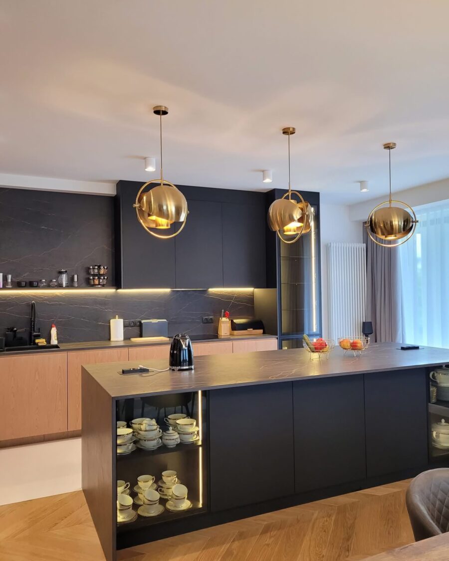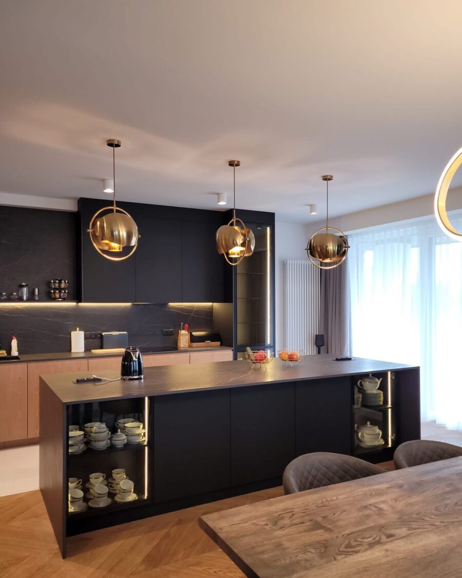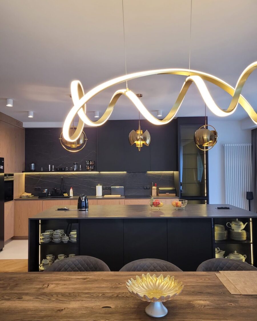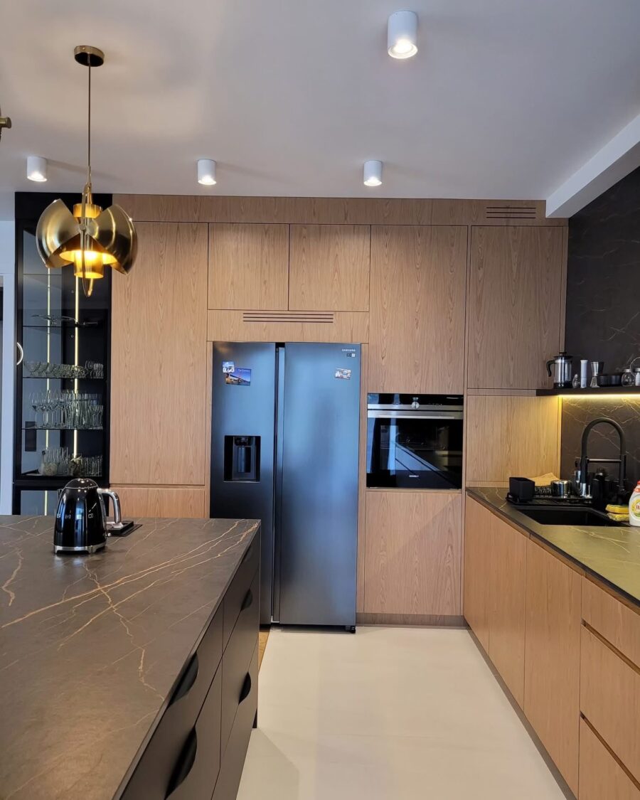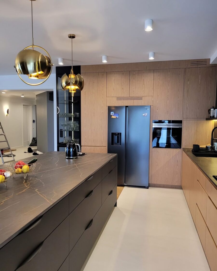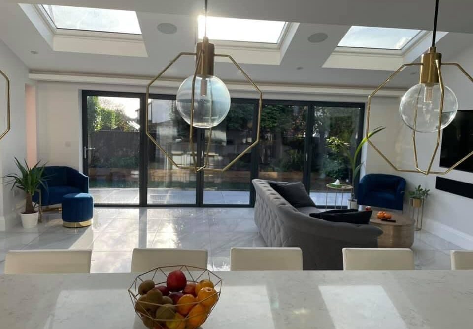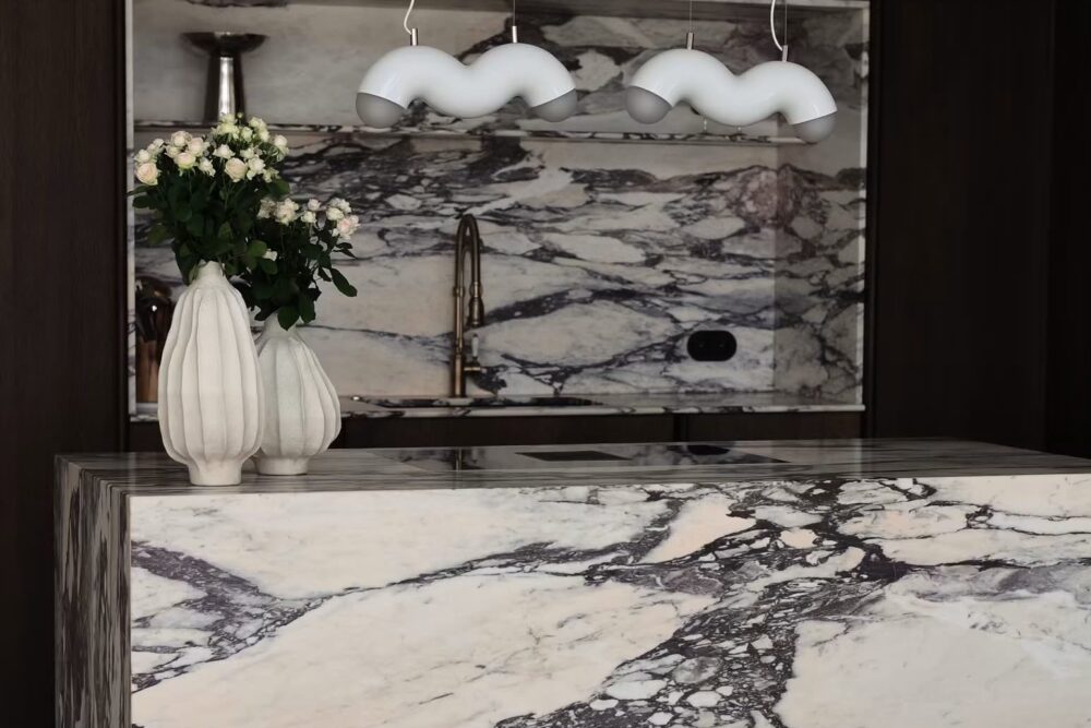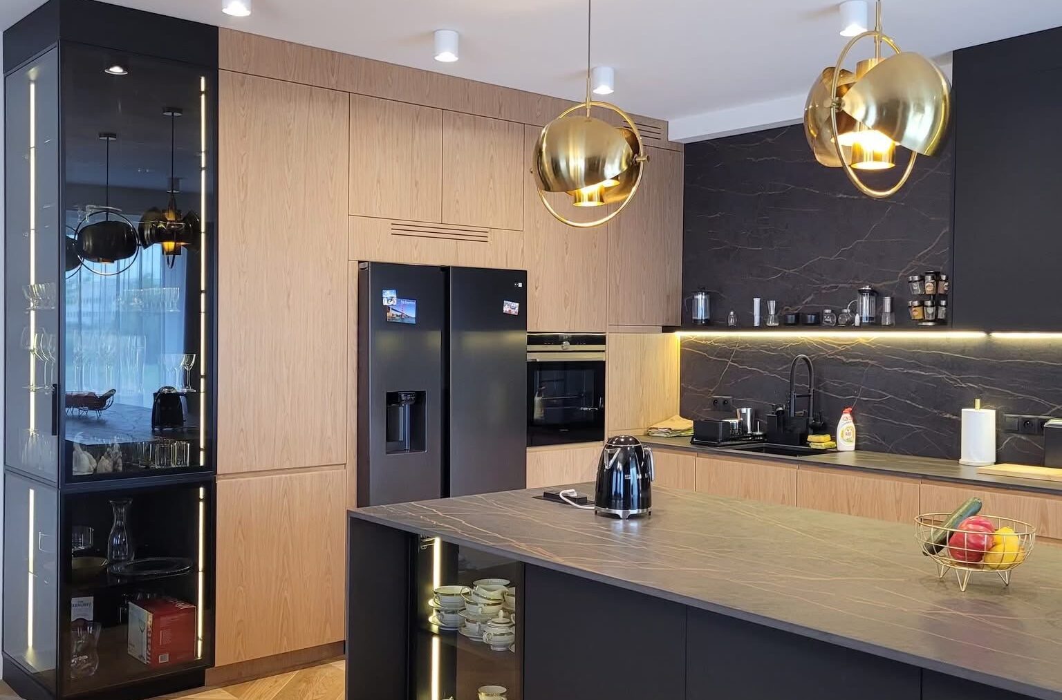
Two cabinet colours and one metal. Warm walnut on the walls, graphite on the island, and three gold globes doing all the decorative work.
The decisions
Putting the dark colour on the island and the warm one on the perimeter is the right way round. The island is the thing you stand at and walk round, so it can take a heavier colour; a room with dark walls and a pale island feels like it is closing in from the edges.
The tall run is walnut from floor to ceiling with the ovens set into it, so the working wall stays unbroken. No wall cabinets above the worktop at all, which is what keeps the room feeling as open as it does.
Open shelving inside the island end, lit from within. It is a small amount of display in a room that is otherwise entirely closed storage, and it stops the island reading as a solid block.
The pendants
Three gold globes, hung in a line, low enough to be part of the room rather than part of the ceiling. They are the only decorative object in the kitchen and they are doing the job that an entire wall of open shelving would otherwise be asked to do.
Details that matter
- Stone worktop with a mitred edge, so the island appears to fold rather than to sit on a carcass
- Herringbone oak running under the island and through to the dining end
- Concealed strip lighting under the tall run, which is what lifts it off the floor at night
- A dining table in the same timber family as the walnut, so the two ends of the room belong together